
One of the first things we learn as toddlers after colors and if you were like me, animals, is shapes. We have toys and puzzles and books all having to do with shapes. They are basic building blocks of almost everything. I remember watching video after video showing how disney characters were drawn, and they all started from your basic shapes.
It’s safe to say that shapes are also the foundation of design and are very important to understand when it comes to logo design and marketing materials.
As you start the brand development process or are DIYing your own marketing materials or logo, there are some very important things that you need to keep in mind, and make sure your designer knows. There are five design elements that are important to get right for the success of your business and how your business connects with your target audience. The elements are shape, typography, color, style, and scale. Today, we are going to tackle shape.
PSYCHOLOGY BEHIND SHAPES
Now there’s something a little bit deeper when using shapes in your marketing material than just squares and circles. There are actually psychological factors in play. When we think about using shapes in our marketing material or logo design, we need to keep in mind that each shape has historical and cultural factors behind it and each shape symbolizes specific feelings. When we use a shapes in the wrong context, we disconnect and confuse our audience, which normally causes them to go elsewhere with their money.
Our customer’s brain is constantly making decisions about how much energy to use where. Each of our brain’s purpose it to keep us alive and thriving, which means burning the least amount of calories as possible. You have to think back to our ancestors and how their brains functioned back then. Their brains were ready at a moments notice to make the immediate decision to fight or flight for when their camp was attacked by intruders or wild animals. That means our brain’s automatic response is to use as little energy as possible so that it’s stored up for the big stuff – stressful situations and big decisions.
So when your brand doesn’t connect or make sense, your customer’s brain is burning unnecessary energy trying to figure it out, and after a few seconds, their brain decides it isn’t worth their time or energy, and so it turns off. Donald Miller from Storybrand says that when you confuse your customers, it’s the same thing as their brains running on a treadmill….and no one likes treadmills.
CIRCLES
Circles have no beginning and end, so culturally they represent eternal wholeness, unity, and harmony. Think of wedding bands that are supposed to represent eternity together. Also think of the Olympic logo that is supposed to represent the five continents of the world in unity. Circles also represent the sun, moon, earth and universe – think of Nasa’s logo.
Circles suggest well-roundedness and completeness. They also suggest movement and grace, which make them the main element within the spring personality. We think of bubbles and polkadots when we think of spring. Think of Pepsi’s logo and the movement that it gives off. They even have a cool animation on commercials and advertisements of the circle turning around, which plays perfectly into the movement. Also think of the movement in GE’s circle logo.
Circles are also seen as feminine – warm, comforting, sensual and loving, so if you are a company or business that wants to be known for your masculinity, structure, dependability, and professionalism, circles may not be your element. Now there are ways around this, but be sure to work with a designer if you are set on a circle.
On the other hand, when done intentionally circles can suggest protection and restriction. They confine what’s within and keep other things out. Think of any sort of protection – a dome, a fish bowl, even in movies (like Harry Potter) that have “protection spells” normally they are all in the form of a circle.
And lastly, circles symbolize connection and community. Think of the Starbucks logo. It suggests a community of coffee drinkers who like coffee that is a step above the rest, and like to customize their orders for themselves.
So if your business or the main beliefs and values of your business represent perfection, space and time, completeness, community, etc. Circles may be the best option for your logo design, and when paired with intentional colors and typography, they can represent what you want them to.
SQUARES AND RECTANGLES
Sharp cornered shapes like squares and rectangles can be great for businesses that want to come off as more professional, minimal, and forward-thinking.
Squares and rectangles symbolize stability. They suggest trust and honesty and represent order. They also represent mathematics, rationality and formality, which is why a lot of banks, accounting, and tech companies use squares in their logos. Think of American Express, Microsoft, and Nordic Bank.
The rectangle is the most common geometric shape that we use, so if you want to suggest familiarity and stability for your business, choose a rectangle.
Lastly, squares and rectangles suggest conformity, peacefulness, solidity, security and equality. Think of BBC, who’s mission is to inform, educate and entertain – wherever you are, whatever your age. You can also think of National Geographic that brings the extreme beauties of the world to everyone in magazine form. You can also think of the Lego logo that brings fun to all ages.
So if your business or the main beliefs and values of your business represent stability, trust, rationality, conformity and security, squares and rectangles may be the element for you.
TRIANGLES
Triangles surprisingly have a lot of cultural and religious suggestions. They represent religious trinity, self-discovery and revelation. So if your business has a strong religious background or wants to symbolize three parts working together, a triangle might be the best solution for you.
When sitting on their base, triangles represent stability and strength. When they are on their sides or standing on their heads, they represent instability, which companies can use in their favor if they are breaking out of the norm or want to be highly unique.
Triangles represent dynamic tension, action and aggression. They have a lot of energy and power and can suggest conflict or steady strength, depending on which way they are sitting. Think of Delta airlines which has the triangle sitting on its base, which represents stability, and with the triangle broken into two pieces and pointing upward, suggests up-word movement.
Like circles, triangle can suggest movement based on which way they are pointing. Think of Quantas or Google Play. Youtube also has a triangle within their rounded rectangle, suggesting action with a play button.
Triangles also convey progress, direction and purpose and can be seen in a lot of high-tech companies logos. They have a little more edge to them than squares and rectangles do, so if you’re wanting to symbolize strength, but also action and energy, triangles are a great option. Think of Google Drive and Adobe who both use a form of a triangle. Mitsubishi Motors and Citgo also utilize triangles.
LINE
Lines are the most basic design element. Lines are two connected points. They can be used to divide space or draw the eye to a specific point.
When lines are used vertically, they suggest masculinity, strength, aggression, courage and power. They can also symbolize movement and progress based on how they are used. Think of Cisco and Soundcloud’s logos.
When lines are used horizontally, they suggest community, tranquility and calmness. Think of At&t’s logo.
Lines can help us perceive space, like IBM’s use of lines to create the shape of the letters without actually using a font.
The thickness and type of the line is also significant. You can have everything from thick to thin, dotted to dashed, vertical, horizontal and diagonal. You can also have curved lines. And these types of lines paired with the shapes we’ve already talked about is significant and can change the meaning of the shape drastically.
A rectangle with a really thick line gives off a different feeling than a really thin line. Thick lined shapes are a little more clunky and have a more casual look to the shape. Thin lined shapes are sharper and crisper.
ORGANIC SHAPES
Organic shapes are irregular shapes that you often can find in nature. They have more curves and are uneven. They tend to be pleasing and comforting, because they are more relatable to us. Think of rocks, leaves, water, animals.
They are free form, asymmetrical and convey feelings of spontaneity.
If you are wanting to add interest or reinforce different themes, especially in nature, then organic shapes are great for you!
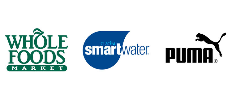
Think of the Whole Food’s, Puma, Smart Water.
ABSTRACT SHAPES
Abstract shapes are more literal representations of ideas or direction. Abstract shapes have a recognizable form, but are not real. They are stylized or simplified versions of organic shapes. Think of the man and woman icon for bathrooms. They are abstract shapes of people.
A lot of abstract shapes have universal recognition. Think about Apple’s logo. It’s a simplified take of an apple. Same thing with any logo that contains a heart. It is an abstract version of the idea of a heart and what it represents, while the human heart looks nothing like an icon heart.
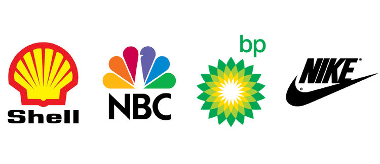
Nike is a great abstract shape, also NBC, BP, and Shell.
I hope this gives you more of an idea of what shapes should be used where, and that there are so many options for symbolizing your ideas through shape.
Next, we’ll look at typography and what each type of font represents and how it should be used in marketing and logo design. Check it out here.
Comments +