“Building a good font collection is like populating one’s wardrobe. It requires a balance between versatility and expressivity…everyday accessories, and special outfits for special occasions.” Jean-Baptiste Levee
Jean Baptiste is so right. With your wardrobe you need a variety of pieces to wear depending on the occasion. You need everyday clothes, but also nicer outfits for weddings, date nights or girls nights out. Fonts are the same way. As a designer, we need to have a collection that is built of a variety of fonts so that we have an arsenal when it comes to designing for any occasion or type of project. But it doesn’t have to be just designers who build their collection of fonts to use. I would suggest anyone, especially business owners to build up a small collection of different fonts so that you have them when you need them.
By now, the mass majority of people who aren’t designers have strong feelings toward the two most hated fonts in history – papyrus and comics sans. Google either of them and you’ll find hundreds of designer jokes, graphics, and memes about these fonts.


In short, fonts can elicit very strong feelings.
Typography is an art and when done right, it is beautiful and inspiring. When done wrong, it can give off the wrong feelings and can turn into a laughing stock like Papyrus and Comic Sans. That’s why it’s so important to get your type right in a logo or design that is going to be the face of your business and plastered everywhere from your sign outside, to your website header, to your marketing material and menu.
Now as a part of my process, I take each client through the process of discovering their seasonal personality using keywords pulled from their mission statement, business purpose, customer testimonials and business characteristics. As we narrow into one season, it comes with guidelines on shape, line thickness, style, and the typography you should use for the personality and how you want your business to come across to your customers. So this lays a foundation for us to then build upon and customize.
There are many categories of typography, but today we’re going to talk about the classic 5 forms of typography: Serif, Sans Serif, Script/Hand drawn, and Display.
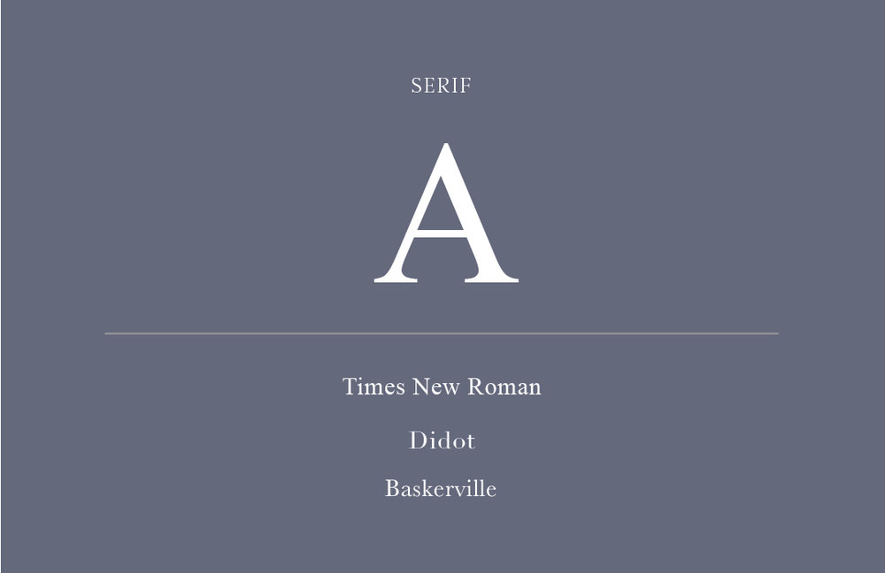
SERIF –
They are called “serifs” because of the small lines (or serifs) that are attached to the main strokes of characters within the typeface. These are fonts like Times New Roman and Didot. Serif fonts also have the thin to thick transition and are the easiest to read.
SANS SERIF –
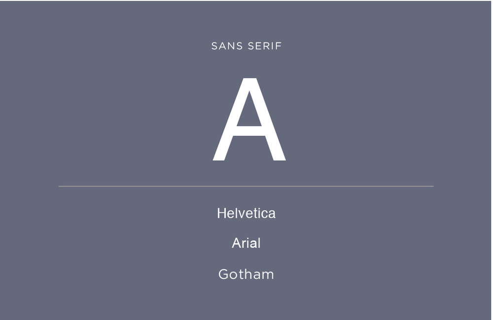
Typefaces that do not have the “serifs”. They are more modern and cleaner than the serif fonts and are composed of simpler lines. They often DON’T have the thin to thick transitions that serifs do. They are used very often for screens, because website resolution can make serifs hard to read. These are fonts like Helvetica, Arial and Gotham.
SCRIPT –
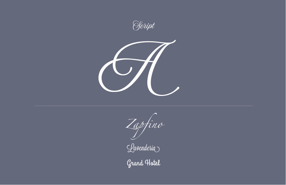
Fonts that mimic cursive handwriting and offer very fluid letterforms. There are formal and casual scripts. The formal scripts are the ones you see on wedding or formal event invitations, book covers or more historical designs. The casual scripts are more legible and mimic sign painters rather than calligraphers. The formal scripts are fonts like zapfino and lavanderia, and casual scripts are like allura and grand hotel.
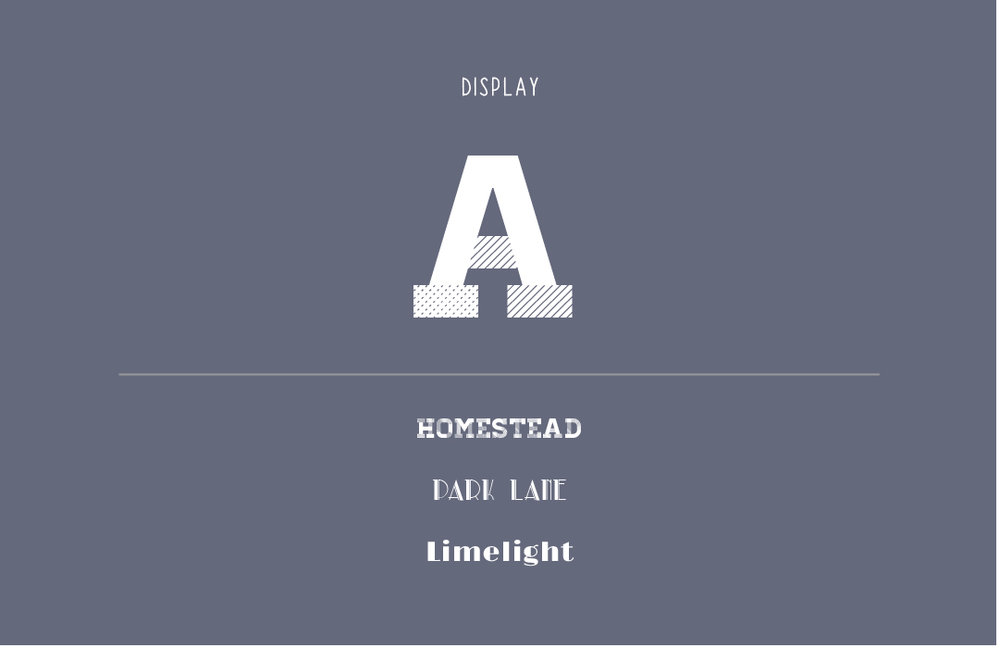
DISPLAY/DECORATIVE –
The main characteristic is that aren’t appropriate for body copy and are best reserved for headlines or attention grabbing. They also are used to entice a reader into the text copy and/or are used to create a mood or feeling for the piece. These are fonts like homestead, park lane and limelight.
TIPS FOR PAIRING FONTS
Tip 1: When in doubt one font can be used from Headline to body copy.
When you are scared to mix, just find a good font that has many weights (bold, regular, thin, all caps, italic, etc). Use the bold and all caps for the headline, the regular italic for the subheading, and the thin weight for the body copy. Voila, you have a piece that has interest and hierarchy while only using one font.
Tip 2: Pair fonts that are appropriate for the occasion.
When designing a piece, one of the main questions you should ask yourself is: what is the purpose or occasion of this piece? Is this a business document, is this a concert poster, is this a baby invitation? Different fonts will be used depending on what the overall style and purpose of the piece is. A business document would use more professional serifs and sans serifs, a concert poster might use heavy display fonts and casual handwritten fonts, and a baby invitation might use a script. Think of the occasion and style of your piece first and then pull your fonts from there.
Tip 3: Think about the time/feelings.
A lot of fonts evoke specific feelings and time periods. There are fonts that were created specifically for the 1920’s speakeasy vibe and there are fonts that were created for the outer space, Star Wars fans. Neither of those fonts should be used for a Lawyer’s logo design. Do your research about the time period a font was created for, and think about the feelings you have as you pick fonts for your arsenal and use them in marketing pieces.
Tip 4: Pair fonts that have different weights/thickness.
Using a variety of thin and bold fonts adds interest and movement through a piece, but you don’t want to get too crazy. Pairing one thicker weighted font with a thin font is a good rule of thumb, especially to create hierarchy.
Tip 5: Depending on the piece, stick with pairing 2-3 fonts at a time.
Any more than 3 fonts in one piece can get confusing and start to look messy if you’re not a professional designer. Pairing 2 or 3 fonts together at once gives the perfect variety. This would look like a specific font for the heading, a different font for the body copy, and a third font for any added interest or call outs in the design.
I hope these tips help you start to think about building your collections of fonts. You can start browsing for fonts over at fontspring, fontsquirrel, myfonts, creative market!
Comments +